Let’s talk Tile
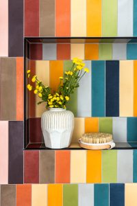
Tile is a hot topic these days. Subway tile doesn’t necessarily reign supreme and we are seeing that clients are open to having a little more fun with these selections. I was recently featured in this article on Living Etc where
When you live in your home for over 20 years, it can be such a game changer to spruce up your bathrooms to make it feel new! That’s exactly what these lovely clients wanted to do, and we were so excited to start their home renovation by taking their bathrooms from outdated + dreary to elevated + luxe.
Our clients brought us a vision that we were so excited about! They wanted to upgrade both their upstairs + downstairs bathrooms to feel more luxe and clean, and have a hospitality vibe to them. We decided to use a black + white palette for both bathrooms so that they went together, but to differentiate the patterns and finishes enough so that each felt distinct.
Let’s talk upstairs bath: we started by going in and demoing the walls to recreate the floor plan. But when we went to demo, there actually wasn’t HVAC – just a hollow drum, which was great news for us! This allowed us to shift the shower over, which allowed us to have more floor space and we could add a linen closet. We also demoed the initial countertop to add in a double vanity. Full hospitality suite vibes unlocked!
Once we had the bathroom restructured, it was time to add in beautiful finishes. We’re talking the good stuff: marble, black cabinetry, Waterworks fixtures, and polished-nickel widespread faucets were all sourced to take this bathroom to the next level.
Even though our clients wanted this bathroom to feel luxe, we wanted to find a balance so it didn’t feel too formal.. We found this awesome black + white tile that comes in three different patterns to create a playful quilt-like pattern.
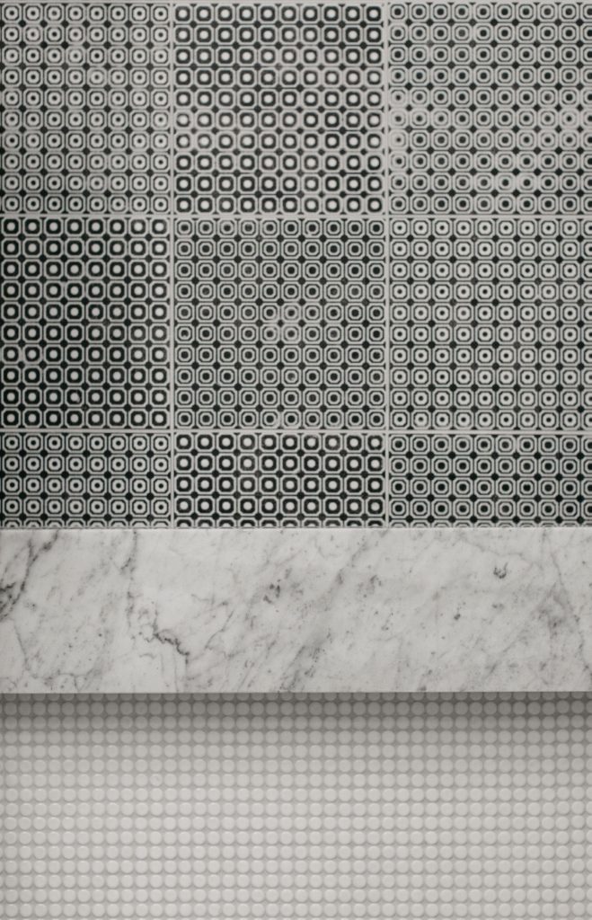
Also how cool is this tiny shower tile?? We had been wanting to use this tile forever, and we’re so happy we found the right space to put it in!
It’s safe to say we are so happy with the final outcome of this bathroom:
Moving on to the downstairs! This bathroom is located right next to the home-gym, so we wanted it to be a little more playful but not color driven. We decided to use quartz instead of marble for the countertop since it is a less porous material. We completed the look with a picket tile in a dark slate finish — which added a ton of drama. We utilized marble on the floors to tie back the finishes from upstairs.
A lot of times our clients can be afraid to use a dark tile, but we have some tricks up our sleeves to keep things bright! For starters: a crisp, white grout can go a long way to lift the darkness, and using a reflective tile helps to bounce off light. The result? A super high-contrast yet bright space.
Check out the final look:
And there ya have it — The Tale of Two Bathrooms! It was so fun for us and our clients to see these bathrooms come to life. We’re currently working on designing their living room in their beautiful Lincoln Park Home, so stay tuned for more!
To see more of our photos, check out our portfolio here.
Ready to start a project with us? Submit a project inquiry form here.

Tile is a hot topic these days. Subway tile doesn’t necessarily reign supreme and we are seeing that clients are open to having a little more fun with these selections. I was recently featured in this article on Living Etc where
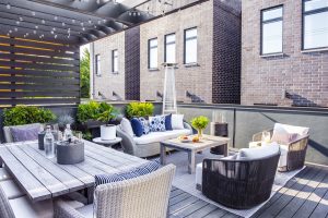
Summertime, and the entertaining is easy. ☀️ This past year has made outdoor entertaining more popular than ever, but sometimes it can be hard to know where to begin when it comes to utilizing and maintaining an outdoor space. Enter:

The nursery is my favorite room in our house, and it is so comforting to see the smile on my son’s face when he is in his room; I have never seen a baby be so engaged with his space.