The Secret Language of Design Books [Coffee Table Books]

weekly feature | Aug 21, 2024 |
In other cases, books send subtle shout-outs to friends, mentors, collaborators and sources of inspiration. Connecticut designer Deborah Pian in—a veteran of publishing giant Condé Nast—likes to style her projects with books by designers she admires, not only to throw out kudos but also to indicate the direction she’s taking with her own work. “My designs are very neutral, so I’m looking for books in that color scheme,” she says. “I’m also thinking about the designers I love, like Jake Arnold and Colin King. I’m a huge fan of Brian Paquette, so if I need a pop of color, that book is coming out.”
The same principle applies for industry veterans. A case in point: Hunt through a photo shoot of a Williams Lawrence project and you’ll find titles by architects like Gil Schafer, who Bunny Williams has frequently collaborated with in the past. “We definitely put people on the coffee table who we like,” says her partner, Elizabeth Lawrence. “Gil is a good example: His work is beautiful, and we collaborate with him all the time.”
Other designers do the same. Stylists and photographers will slip in titles by their other clients. The choice of books in a photo often traces a web of industry relationships that will be invisible to most observers—but if you know, you know. Inside jokes are not unheard of. Lawrence says that many of the firm’s projects have a copy of Donna Tartt’s The Goldfinch somewhere on the shelves—a reference to a playful office debate over whether the bestseller lived up to the hype.
“I used to work for David Easton, and I happened to be there when his book Timeless Elegance came out,” says Chicago designer Laura Tribbett. “Sometimes my coworkers and I would say, ‘Ahhh, timeless elegance,’ as a joke as we were hauling cardboard boxes and shopping for light bulbs—doing all the unglamorous work you do in design. I loved my experience there, [and now] I try to include that book in photo shoots as a nod to my design upbringing.”
Like ivory boucle sofas and fiddle leaf figs, there are coffee table books that have become cliches through frequent use. Ask any designer, photographer or stylist for the best example of this and the first answer is always Tom Ford, the 11-pound black-and-white behemoth published in 2008 by Rizzoli.
For the past decade and a half, Tom Ford has been such a photo shoot staple that its ubiquity has inspired Substack essays and TikTok rants. No one can say exactly how it rose to dominate coffee tables the world over, but it neatly satisfies both sides of the design book dichotomy. As a pure object, its heft gave it the gravitas of a minimalist sculpture (it doesn’t hurt that black goes with everything); as a vessel of meaning, it conveyed hip modernity at a time when Ford himself was at the peak of his cultural power.
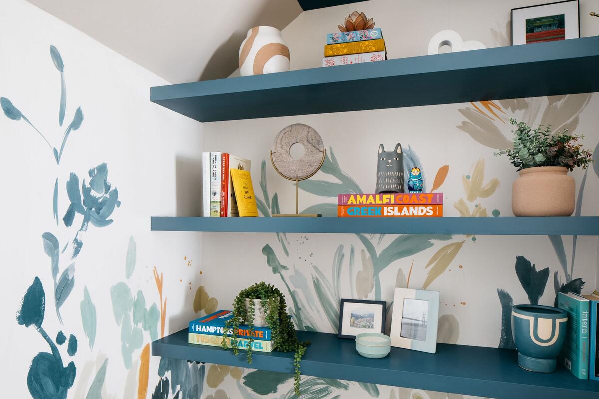
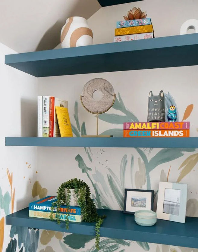
There are others. For a time in the 2010s, Taschen’s enormous Cabinet of Natural Curiosities was adding a quirky touch of coral to coffee tables everywhere. Surf Shack by Nina Freuden berger has been a go-to for waterfront locales. More recently, Assouline’s brightly hued travel books have become a frequent choice for a shot of color—and perhaps a sense of worldliness.