

Client Stories
Los Angeles Nursery
The nursery is my favorite room in our house, and it is so comforting to see the smile on my son’s face when he is in his room; I have never seen a baby be so engaged with his space.

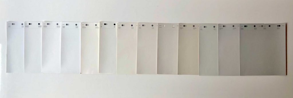
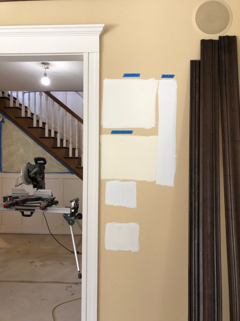
If you’ve ever tried to paint a room in your home white or grey, chances are that you might have been overwhelmed by the amount of options there are for each color. Our clients are always surprised whenever we come to swatch sometimes more than 3 different shades of whites in their home, but we do so for good reason!
The thing to know about paint color is that there are a lot of outside factors that can affect the final outcome of the color. The floors, appliances, and lighting — along with the actual undertones within the paint color, can all trick your eye to change the wall color. Below we’ve listed out our tips + tricks (and a fun paint flow chart!) to help decide which paint color is right for your space:
First things first, read the room! This is when we check out all the major things in your space (that aren’t going anywhere anytime soon) and determine if they are warm or cool. What color are the floors? What about the appliances, cabinets, and countertops?
Understanding all of your home surroundings is so important. For instance, if you have a warm colored floor and want a cool crisp grey color for the walls, you might be tempted to go ahead and pick out a cool grey wall color — but we wouldn’t recommend it! The warmth of the floors, contrasted with the coolness of the walls, will actually result in your wall colors looking blue or purple. To avoid this, you’ll want to pick out a grey color that has warm undertones. It might look warm on its own, but when it’s paired with the warmth of the floors it will look grey IRL. Same thing if you want a white wall — if your floors are cool, and you pick a white with a warm undertone, there’s a good chance the walls will actually look yellow.
We know that it can all seem a bit confusing, so we made a flow-chart to help out!
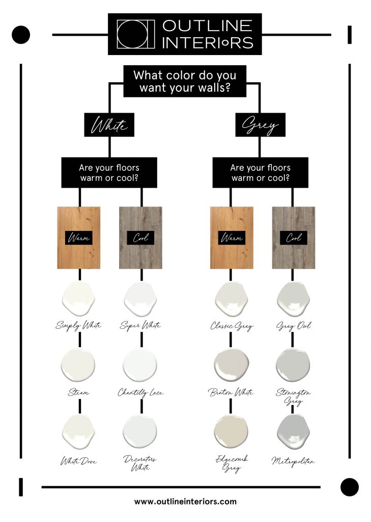
There are also a lot of great resources on Benjamin Moore’s website that help to explain specific undertones of each paint color.
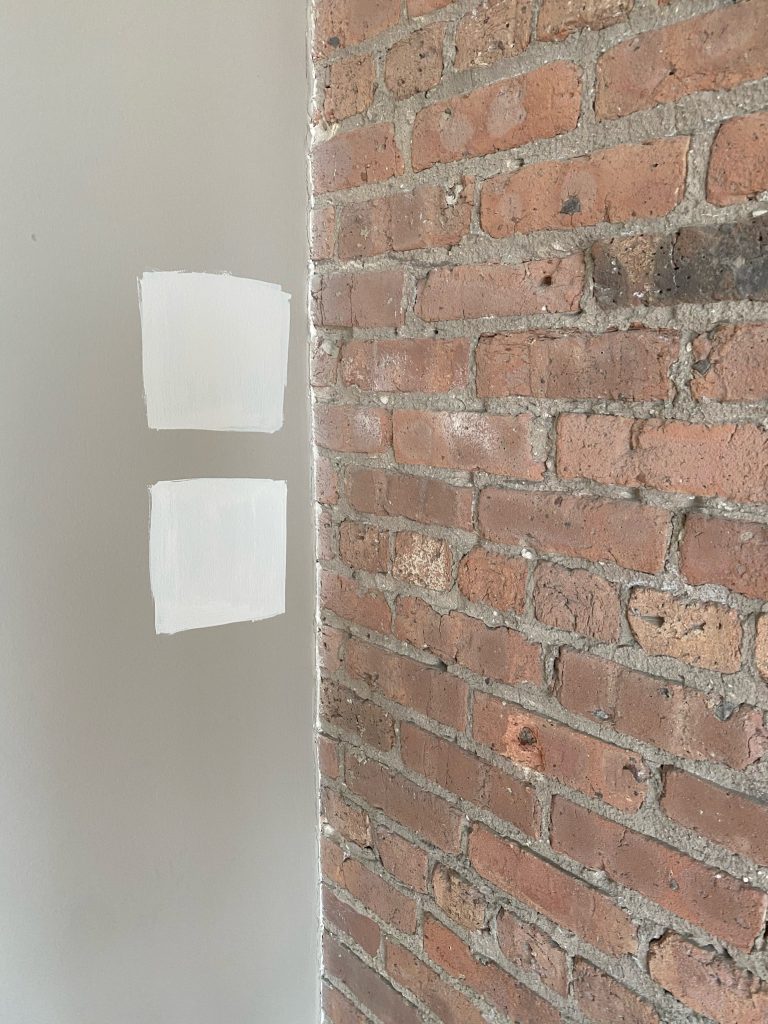
Okay, so now that all the research is done — it’s time to get some samples. We always say “when in doubt, swatch it out!” Even if a paint sample looks almost identical side by side in the cans, chances are they are going to look very different once you get them on your actual wall. Once the swatches are up, it’s time to take some time to see it in different lights (ie in the morning vs night).
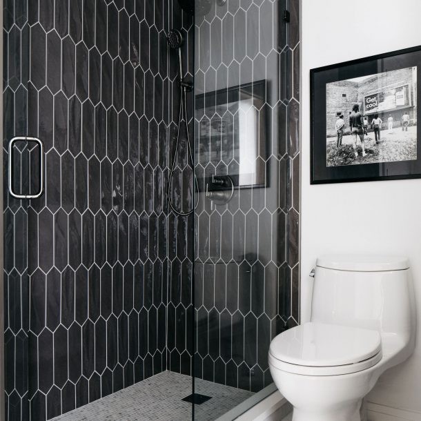
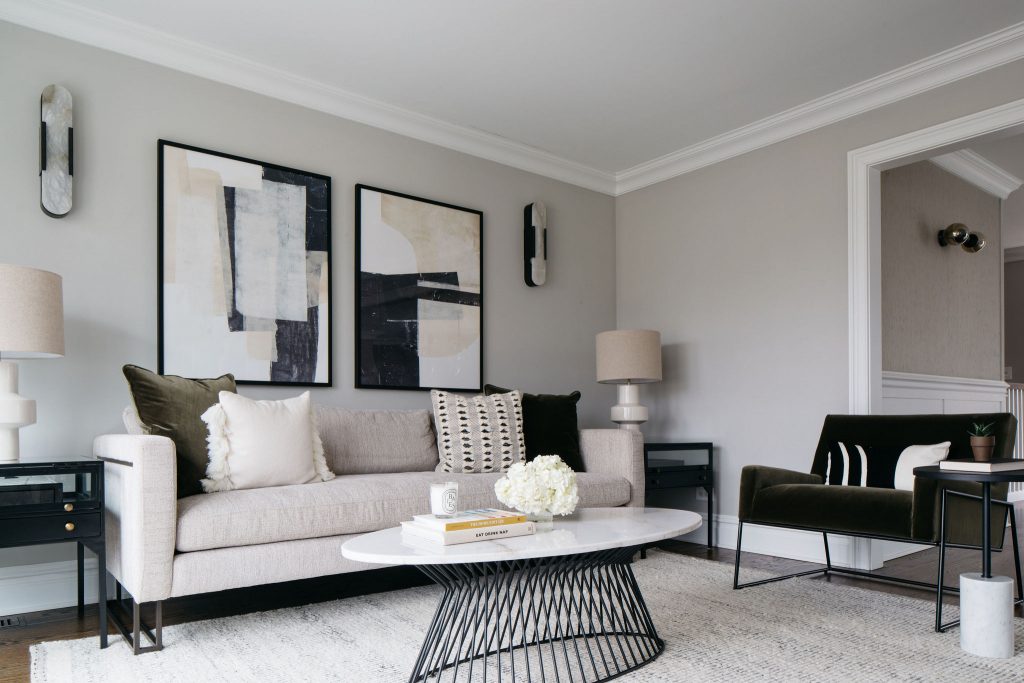
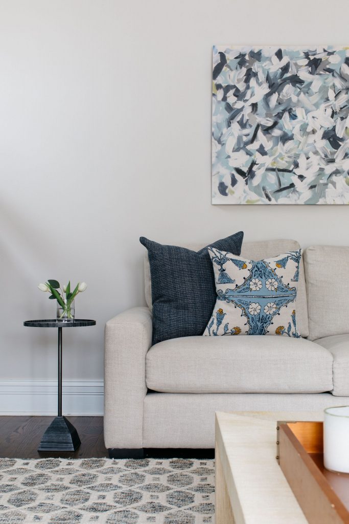
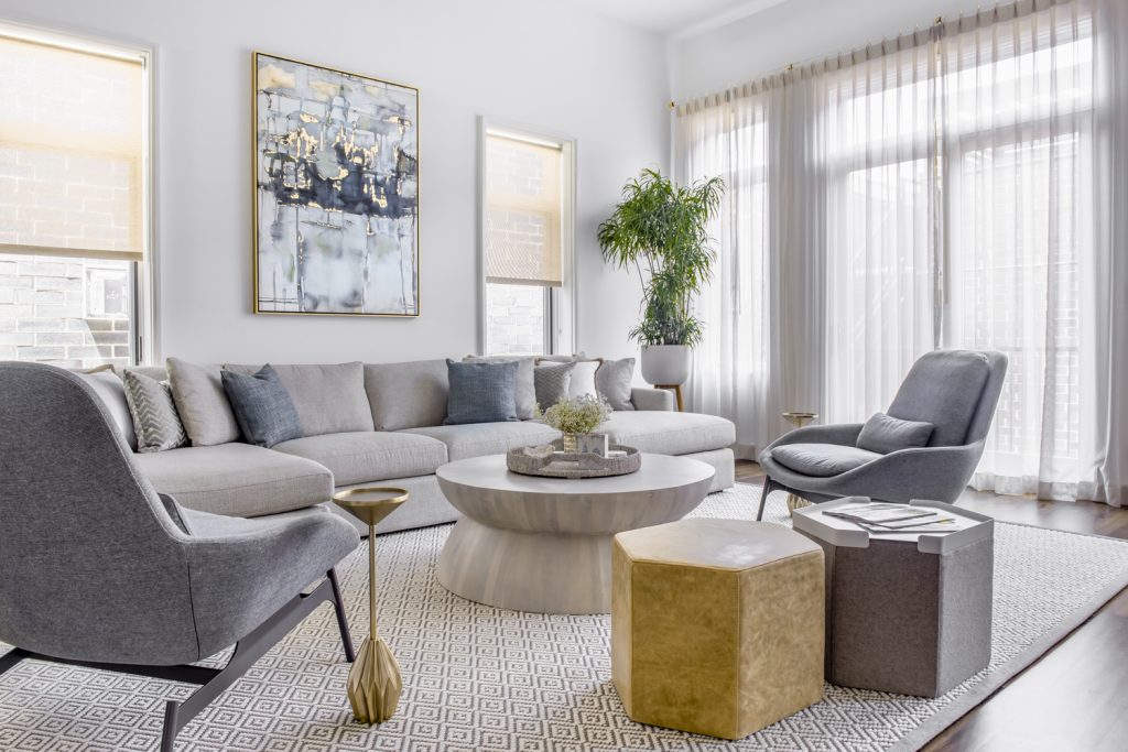
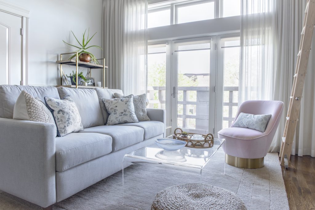
And finally — it’s time to paint the walls! This is when all the magic happens — there’s nothing like a fresh coat of paint to bring life into your space. Check out some of our recent white + grey projects:
Thank you to our friends at Benjamin Moore who always help us with swatches and samples — and who always know everything about undertones!
To see more of our photos, check out our portfolio here.
To get started on your next project, submit a project inquiry form here.
The nursery is my favorite room in our house, and it is so comforting to see the smile on my son’s face when he is in his room; I have never seen a baby be so engaged with his space.

We are thrilled to share that one of our largest projects was recently featured in an 8 page spread in Design Chicago Magazine’s Spring 2023 issue! This project is near and dear to OI as this stunning home belongs to

Working with Laura and her team was a dream! They were professional, creative, accommodating and all around cool. They were patient with my very opinionated husband as well. Can’t wait to book them for our next space. Can’t recommend enough.