Close
We love a good Before & After as much as the next person, but this Kitchen transformation took things to a new level. While a lot of our work leans more modern comfortable and our office is located in the heart of downtown, we met this client, saw her Kitchen, and had to put an OI twist on country Kitchen design!
This empty-nester couple had purchased a beautiful old farmhouse originally built in 1861. Over the years, they sourced and inherited an impressive collection of antique furnishings and other vintage collectibles. The character of this home was perfectly suited for them, but the Kitchen was calling for a dramatic facelift and some functional upgrades.
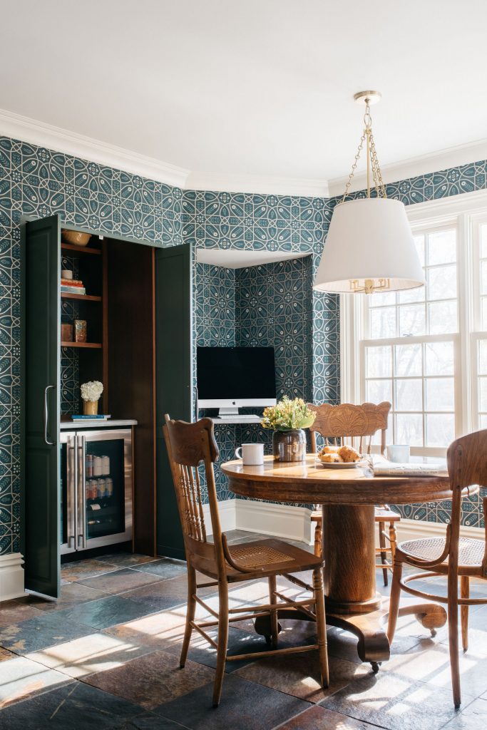
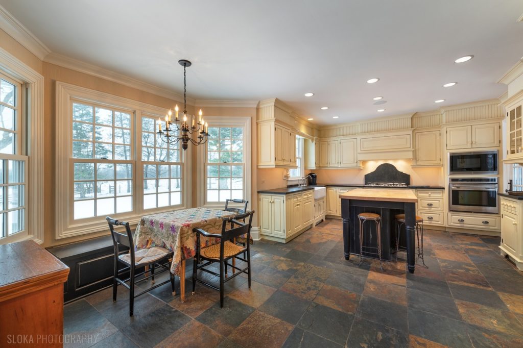
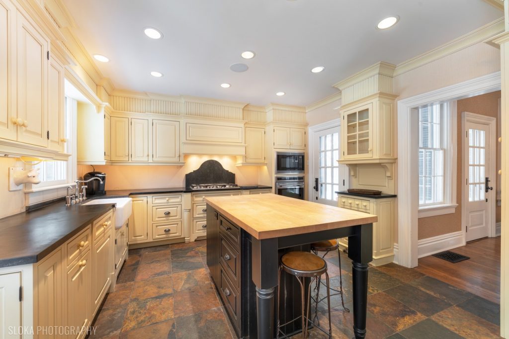
The Kitchen in its pre-OI state was giving off major margarine vibes. The previous owner painted all of the cabinetry and walls various shades of pale yellow and peach. The slate tile floor is certainly an active element in the room and we knew we could reign that in. Additionally, the client was doing some light construction work to the Back Entry to create a new vestibule and coat closet. With that revision happening, we were able to re-imagine the previous coat closet as a new pantry with coffee bar with pocketing doors that opened into the Kitchen and create a little workstation niche in the adjacent corner.
OK down to the nitty gritty – what are the most notable changes we made? Let me tell you!
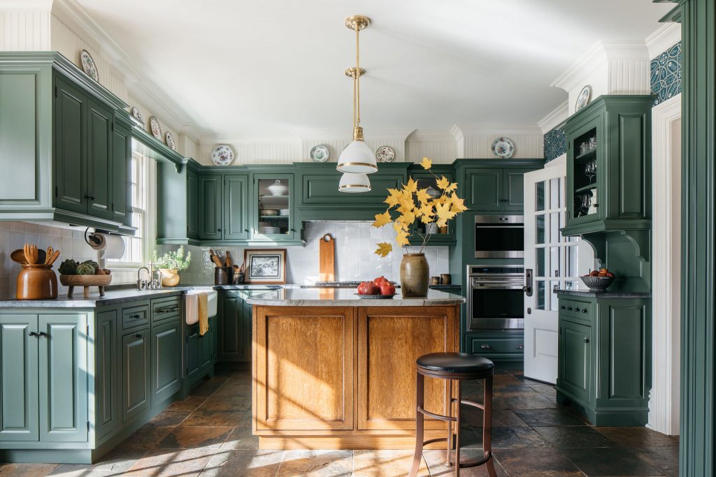
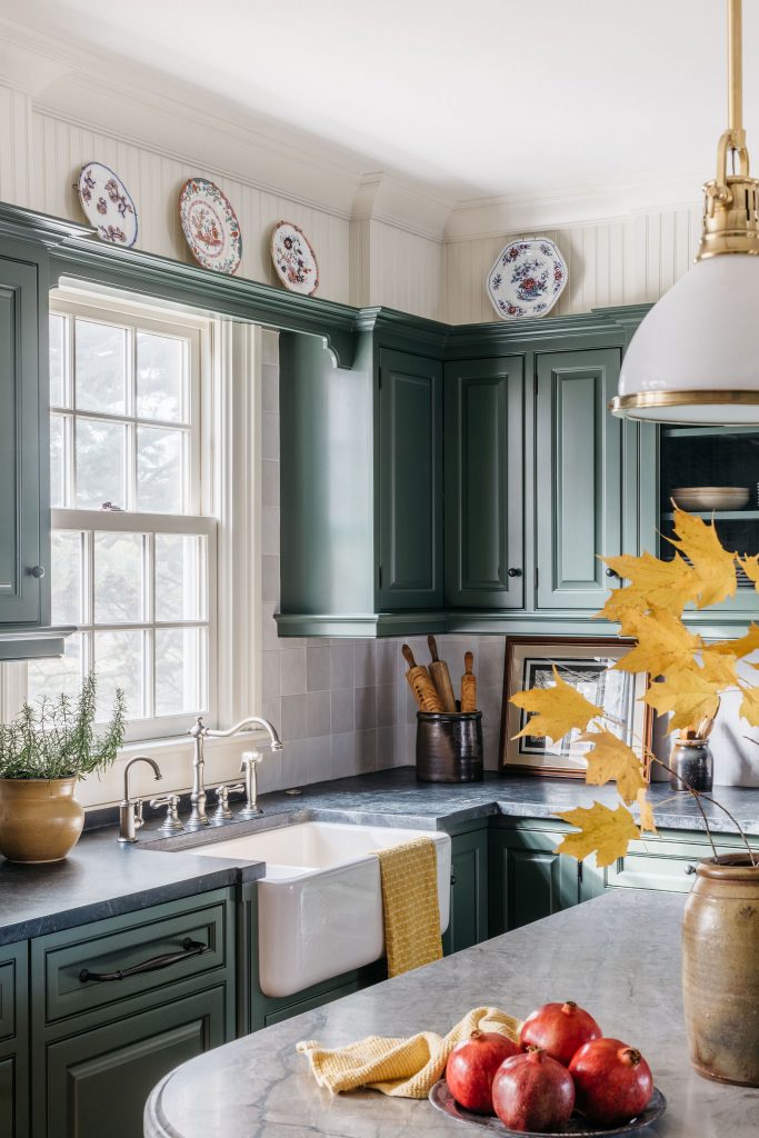
The quality of the perimeter cabinetry was great – so we painted it “Boreal Forest” by Benjamin Moore. The center island cabinetry was dated and just not functional. We designed a custom stained island piece to include wine storage, oversized drawers, and a mixer pop-up. Topping that off with Ocean Blue Quartzite on the countertop with an ogee edge profile was a pure chef’s kiss moment to bring all of the finishes together. Next up, our client really trusted us when we recommended wallpapering the rest of the Kitchen walls. A William Morris trellis wallpaper in deep green and blue created a lovely backdrop pattern for the rest of the space. All of these elements combined allowed for their existing slate floor (that trickles into the back entry, powder room, and laundry room) to make sense and not overwhelm the space.
The best part of this transformation? Receiving texts and pictures of the client and their family enjoying this revitalized space for a slew of festive occasions. We were truly able to breathe new life into this Kitchen. It now blends seamlessly with the overarching character of the rest of the home….and that’s always our end goal.
